

About Me: My professional journey started in Helena, Montana. At 15, I co-founded a non-profit. Its goal was to help educate people on gun safety and gun education. From it, I learned how important consistency and clarity can be in sharing a mission. As I graduated high school I had opportunities to showcase and sell my art. Sharing my work with others taught me the power that visuals have in connecting people and communicating purpose. These experiences led me to the University of Arizona where I graduated with degrees in Marketing and Entrepreneurship.
I studied consumer behavior, market research, and created a business that was ready to launch as part of the New Venture Development Program. I also worked for Hershey’s as a marketing and sales intern- which gave me insight into how large corporations maintain and manage their public perception. Post graduation, I took an offer to illustrate a Children’s Book and move back to Montana. This taught me about working independently and led me to where I am now- consulting with small businesses and making creative impacts with design.
My Work.
This Portfolio includes my most recent work with Creative Consulting and Designing for businesses. For examples of my art, navigate back to the homepage.
Opulence
Opulence Health wanted to improve their brand perception and awareness by modernizing. They were struggling to appeal to multiple target markets and wanted to elevate their graphics to reflect the innovative work they do. I developed a visual guidelines and graphics that better reflected the mission of Opulence to be used for social media, digital marketing, and client-facing materials.
Click “View Project” for examples of the Brand Guide’s implementation and more detail on my work with Opulence.

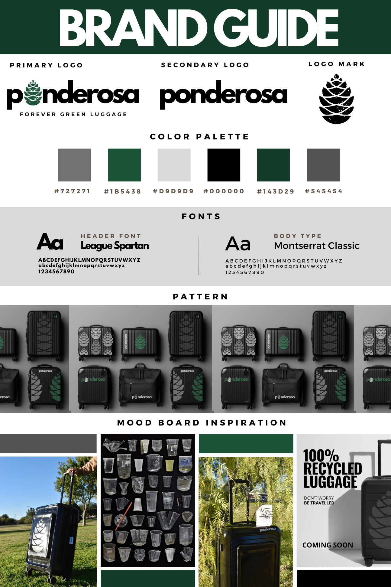
Ponderosa
In response to overconsumption and fast fashion- I created Ponderosa to remind people that they carry the weight of their environmental impact. Every element of Ponderosa was designed with sustainability at the forefront. The branding consists of minimal colors and clean typography to convey simplicity, responsibility, and durability. The goal of the branding was to elevate aesthetics while remaining grounded in the brands purpose.
Click “View Project” for examples of branding/ marketing and more detail on the creation of Ponderosa.
Catalyst2Go
Catalyst2Go was originally “The Catalyst”- a full-service restaurant. During the shift to a takeout business, they needed help rebranding a new identity that maintained some elements of familiarity to their customers. My work on their rebrand included designing a full package of brand assets that could be used on graphics, packaging, signage, and social medias.
.Click “View Project” to see more examples of the branding and transition from Catalyst to Catalyst2Go.
